Below are some of the many projects that I worked on with UPS. The ones named “UPS Global Directory, UPS Supply Chain and Next Gen” – I was the only UX/UI Designer on the team. For “UPS My Choice for Business” – this was an on-going project and required another UX Designer to help in different areas – see details below.
Deliverables: (click links)
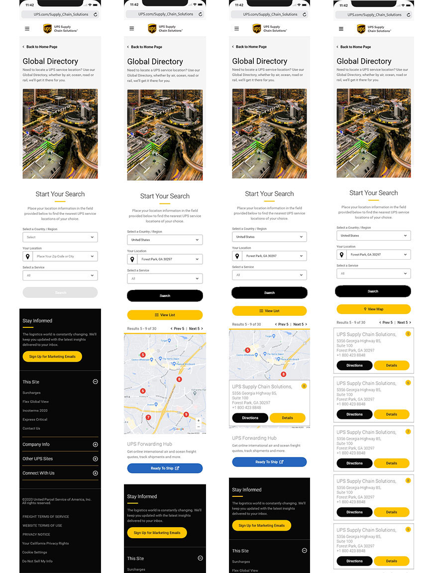
I was brought onto this project to improve on an experience the stakeholders had discovered from the analytics they studied for our contact page. At the time of our initial meetings – they indicated that the PDF link to our Global Directory list of UPS freight locations was being downloaded 3,500+ times a month. The stakeholders were thinking to make the PDF just an interactive page with links to the countries, then to the city and then to the location the user thought was the nearest to them. I suggested to create an interactive world map and they agreed.
Sr. UX/UI Designer - (No other UX designers on project)
The stakeholders indicated through several meetings that I had a time and a programming constraint. I only had two weeks to create the page and they did not want the map to be a full-blown Google map with their functions, but we would (through API’s) send the information to the Google map for any direction details, or sharing, etc.
The stakeholders agreed to build out a webpage for the Global Directory and having an interactive map with limitations.
Deliverables:
The fastest way to get this project completed – is to gather information from the top five related competitors for logistics. Interacting with their search page to see the results and how intuitive are they making their search functions.
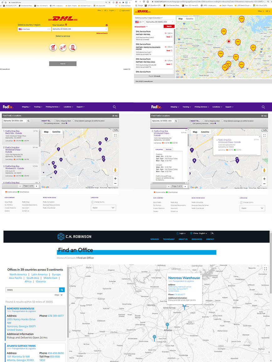
The resulting information that I gathered from the competitors gave me a clear indication of the work at hand. Looking at the UPS Global Directory (the current PDF) I began to write out the common and the differences between each world address. I also notated any additional information that the PDF was providing, so that I could incorporate this into the search and results.
For this project there was no need for wireframes or meetings on the look, because I had all the style-guides within our Design System to keep UPS Brand on point. Also, I created all the verbiage on the page – which I knew would relate to our brand and the pages’ overall function. Below are the results of the time spent and once presented to the team - only minor changes were requested (the image was of UPS planes and trucks, which they asked to replace with a city-scape look).
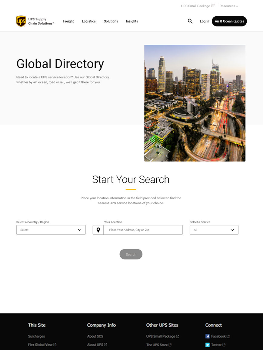
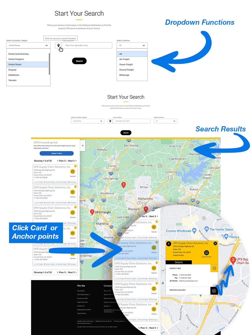
I made the initial page clean with minimal items for the user to interact. I added the dropdown fields to incorporate the required information from the original PDF. On the resulting map – the cards are clickable, which would then place an additional card with more details about the location and would zoom-in on the location.
The development of the mobile and tablet designs at UPS are made the exact same way in regards to dimensions. Reducing size for mobile is not the only factor that I had to consider, but in how the user will interact with the functions and make it intuitive.
At UPS we have heuristic evaluations between the team during our meetings. The Global Directory was a success from these meetings and was approved for development by the stakeholders. Once the project is developed and placed live for UPS customers, we will re-evaluate the results from users' feedback.

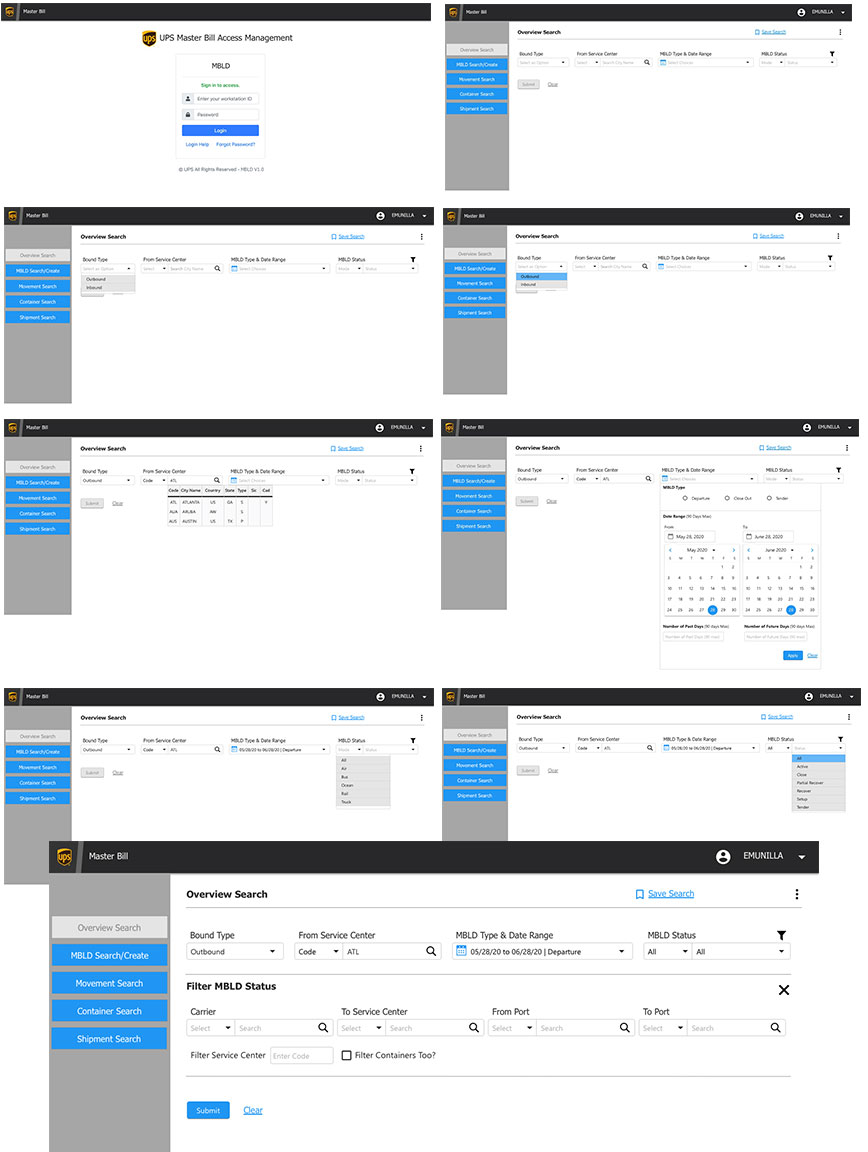
This is a new website at UPS that introduces a scalable logistic service for medium to large companies that connects the user to a tracking application called UPS Forwarding Hub. The Global Directory is part of this new website. I was assigned to be the Sr. UX/UI Designer for the branding and updating certain areas of this site.
Sr. UX/UI Designer - (No other UX designers on project)
The issue that the stakeholders presented was in two parts. The first part was going and updating the content and images to give the user a better understanding of the UPS Forwarding Hub Application. The second was to stop user for “small packages” from using this Application. I only had to focus on part two – and the details that the stakeholders gave me was that the “small package” users were sending thousands of complaints to UPS customer service, because they could not ship their package with the Forwarding Hub Application.
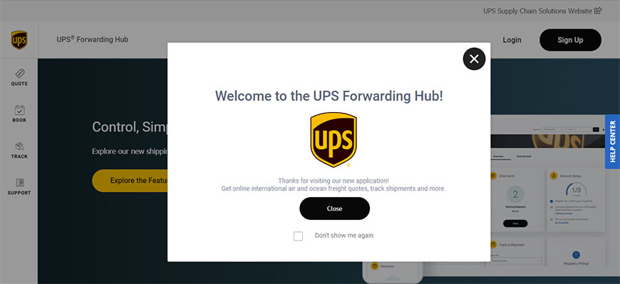
The overall goal is to bring clarity for small package users and prevent them from using the UPS Forwarding Hub application to send their packages.
Deliverables:
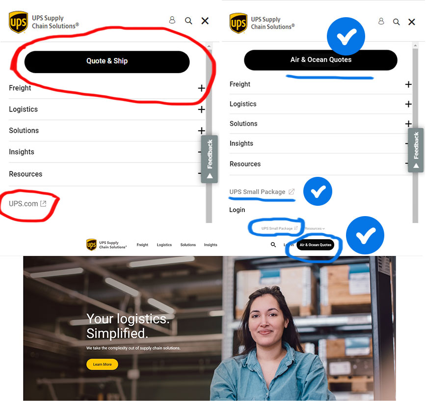
Once the stakeholders provided the analytics on how the users are landing on the UPS Supply Chain website and then, what they are clicking on - the evaluation was very simple. The original verbiage that was used for the main CTA was “Quote & Ship” and the link to direct the small package users was just named “UPS.com.” The solution was to update the verbiage on the CTA button and the link. I purposed to change “Quote & Ship” to “Air & Ocean Quotes” and then the link of “UPS.com” to “UPS Small Package” – the stakeholders approved the solution and has been updated.
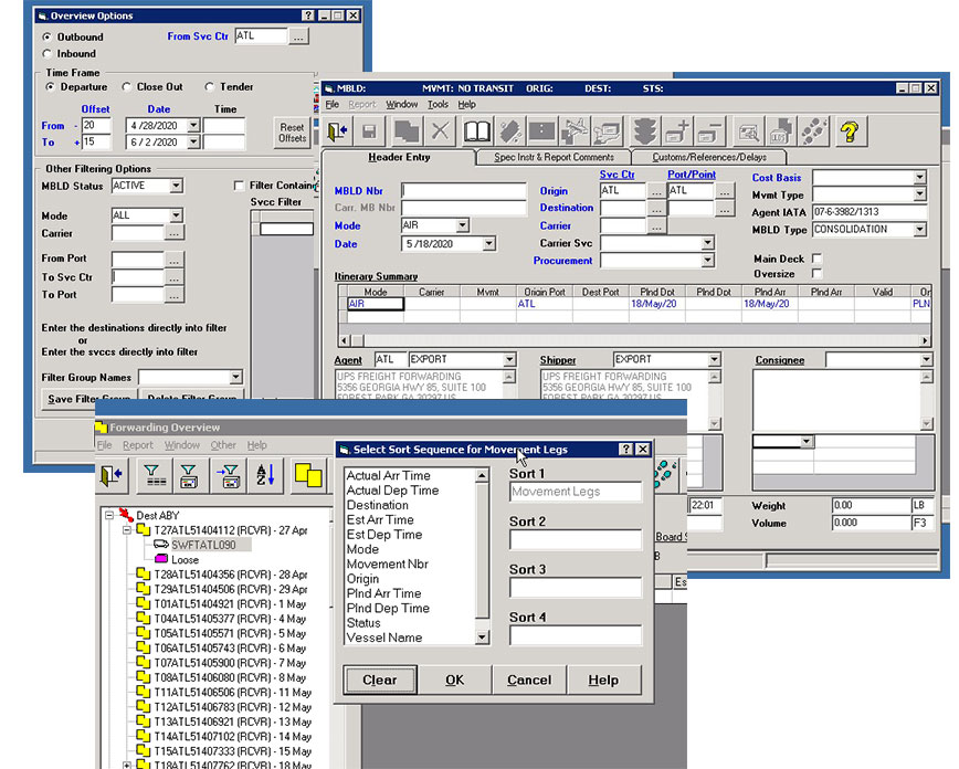
This was a very large project that would take three to five years to complete. This project entails getting UPS’s primary database application called “E2K” - that has been (and still is) used for all of UPS Global shipping for more than 25 years – into the “Next Generation” or an updated modern application for the cloud.
Sr. UX/UI Designer - (No other UX designers on project)
The objectives were formulated from the Stakeholders to copy one section at a time - modernizing the look and feel of E2K. The overall objective was to remove this legacy system, which is costing UPS in upwards of $500k a month to run and maintain – to a cloud format.
The initial search and results sections of the E2K application was the first section to create the new updated UI designs components, so that developers could write the code and placed it on a cloud-base environment.
Deliverables:
This was what the E2K platform looked like and still does. The images are of the initial search with the results and the interaction when the user clicks on a link.
Interviews and Research
Created with Pen and Paper
I used Sketch and Adobe XD for this project. Below are some of my designs for the initial search, results and interactions.
Worked with UPS Brand Standards
The UI designs are for the E2K application and for internal use only, so no mobile UI designs were required.
Unfortunately, the project was cancelled by higher-ups, because of budget cuts from response to COVID-19 and other projects had precedence over the E2K project. So, all my work had to be shelved until further notice.
This was an ongoing project with a combination of “My Choice for Home” and “My Choice for Business,” but this example work is for “Business.” The team consisted of two other UX designers from a third-party company that UPS has used over the years, as well as, stakeholders, managers, business analysts and copy writers.
Sr. UX/UI Designer - (Two other UX designers on project)
I was asked to see what UI design ideas I could develop to display delivery status for business customers. I was also invited to collaborate with fellow UX designers to heuristically evaluate the current and developing UI design concepts.
The job was to create a few UI displays for the delivered packages, on schedule packages and others. The UI would need to be intuitive and we would test with our current customers to see if the results of UI designs would be effective.
Deliverables:
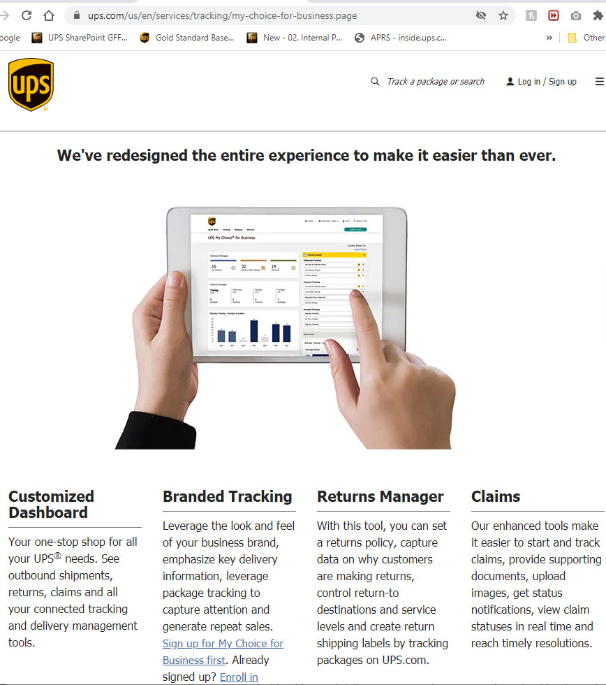
Below is the current display for My Choice for Business. This image was taken for UPS website to give an idea of the overall look and features.
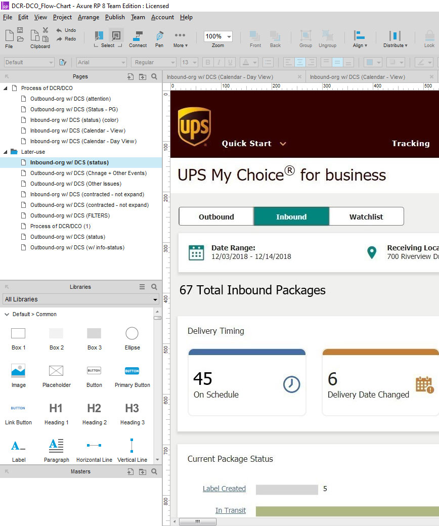
Below was the UI designs for “My Choice for business” that I worked on to change the “Delivery Timing” section of the application. They were designed using Axure RP 8.
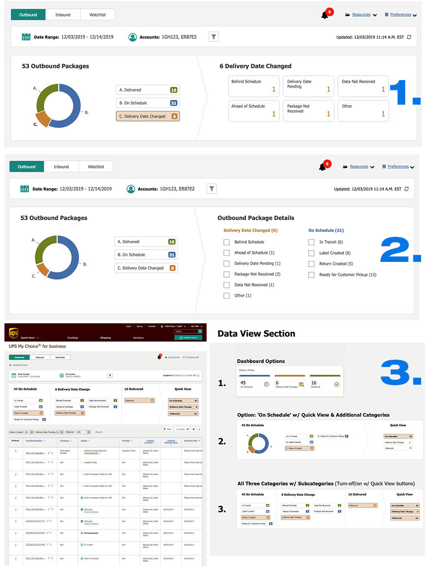
Below are a few examples of engaging and non-engaging designs. For the one marked as “1.” – this is an interactive and engaging UI design. If the user clicks on the circle (A., B., or C.) the circle image will expand and also high-light the same text button “C.” The rest of the examples in #2 and #3 are variants of UI designs that was presented to the team for collaboration and modifications.
The final results of this project I am not aware of, because once I had finished, I was placed on another team and thus, another project.
