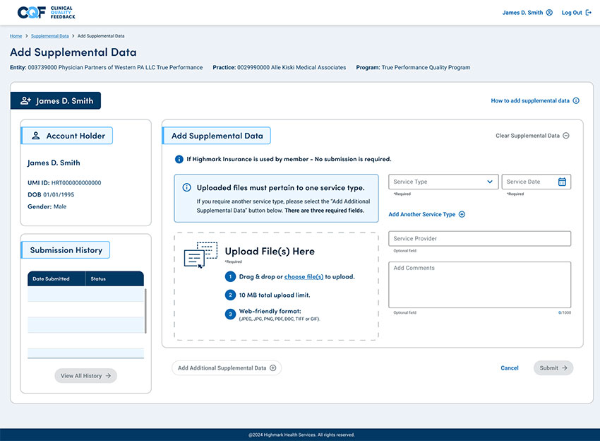
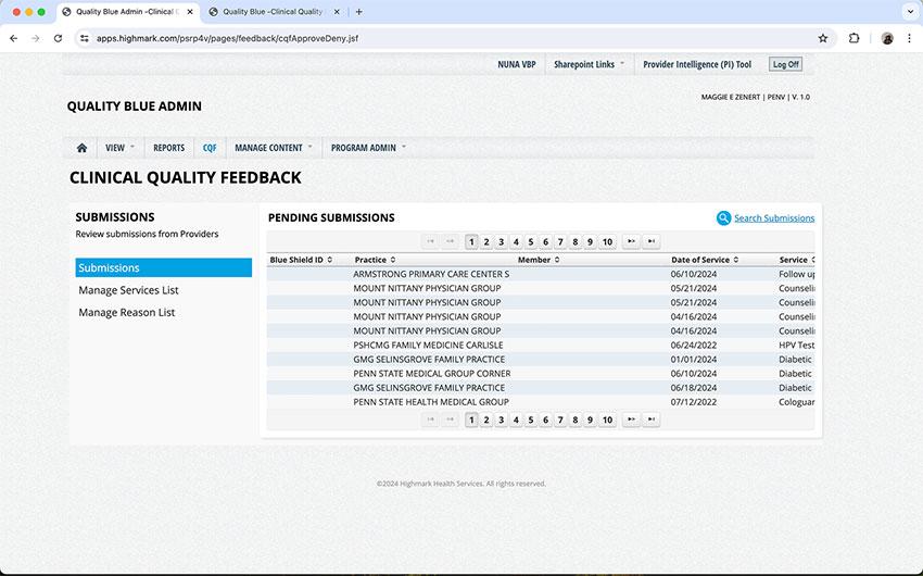
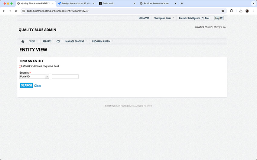
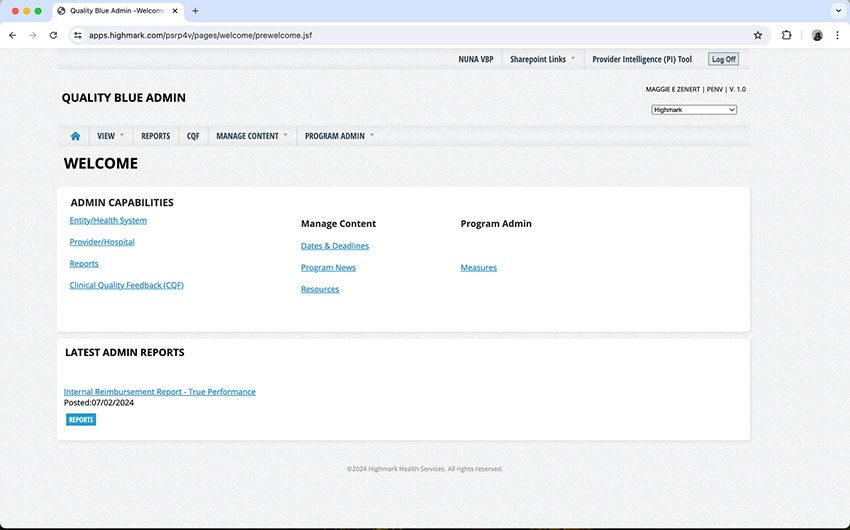
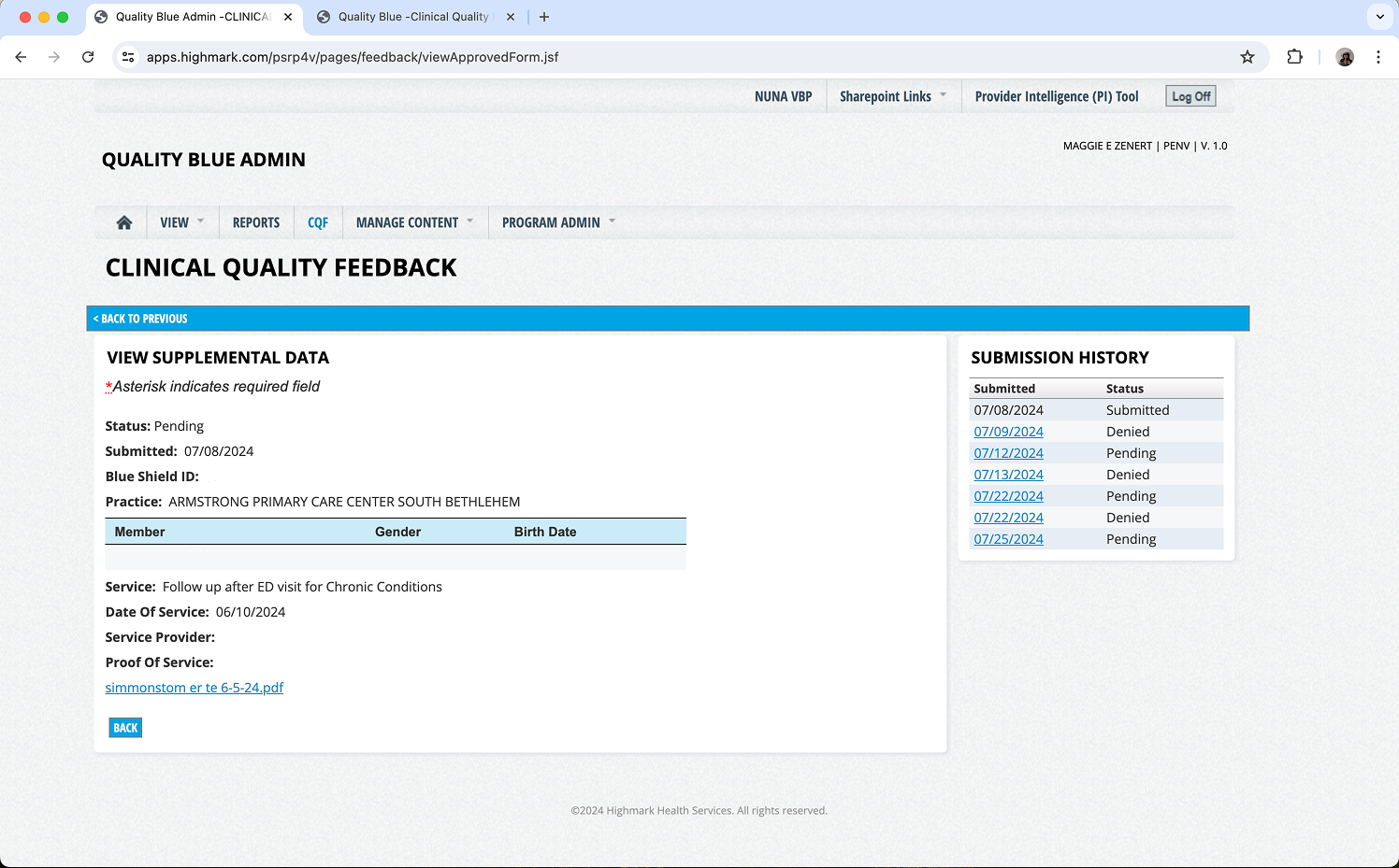
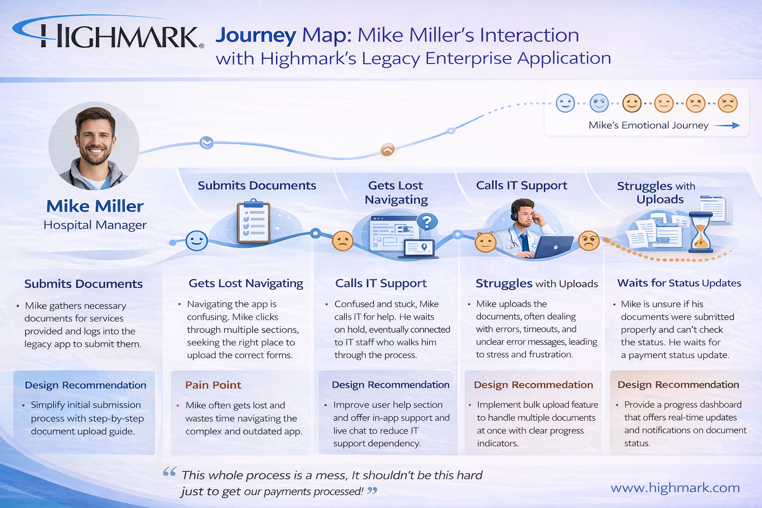
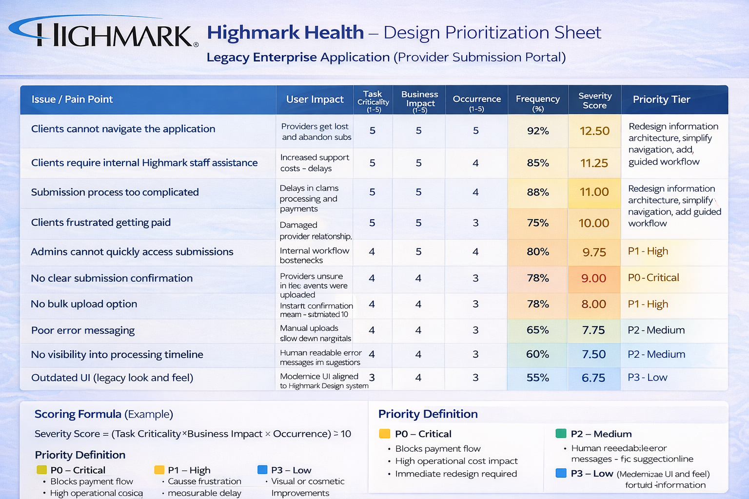
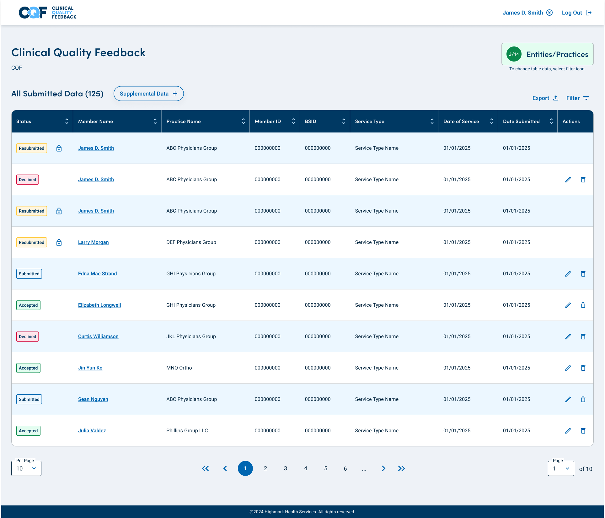
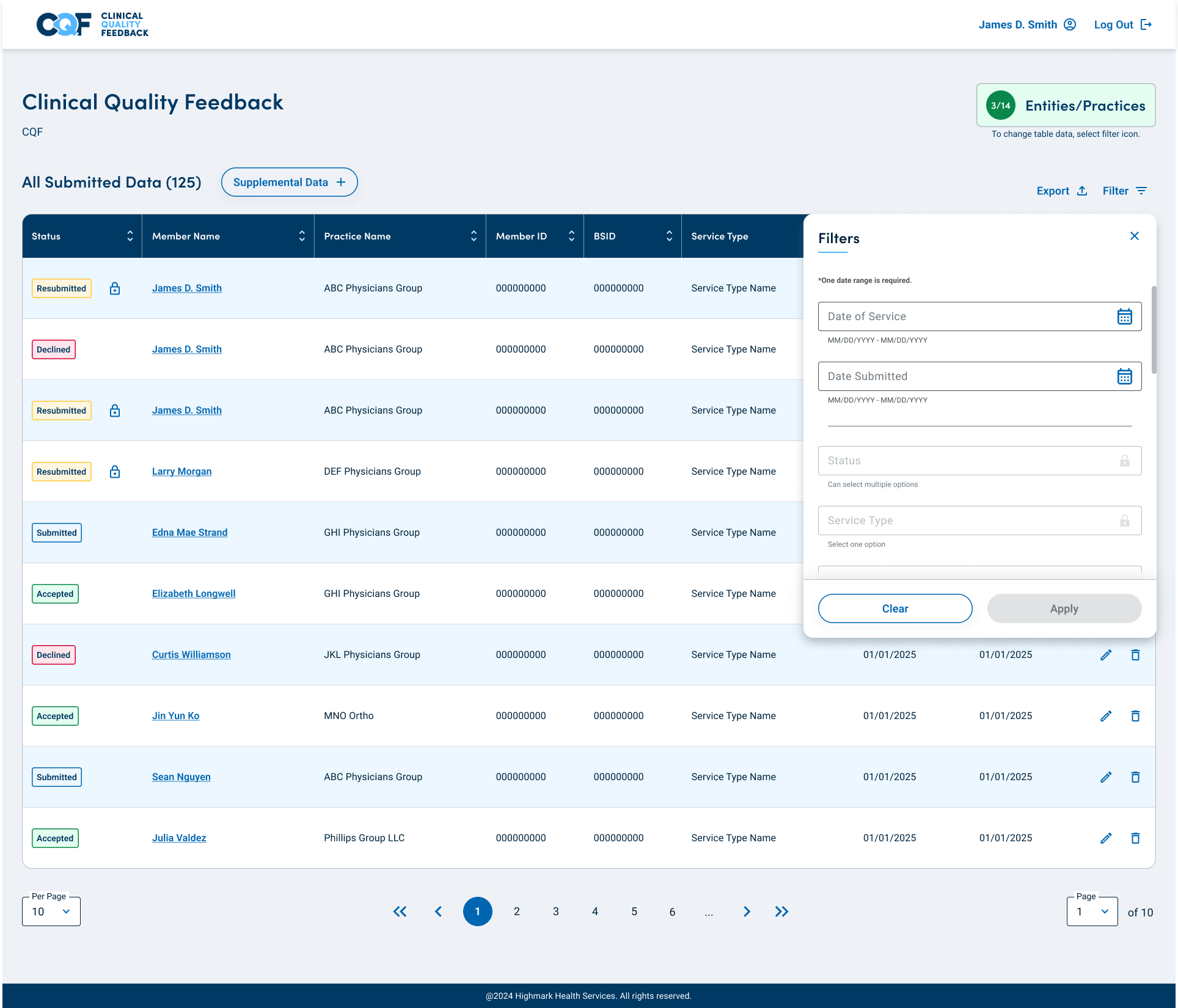
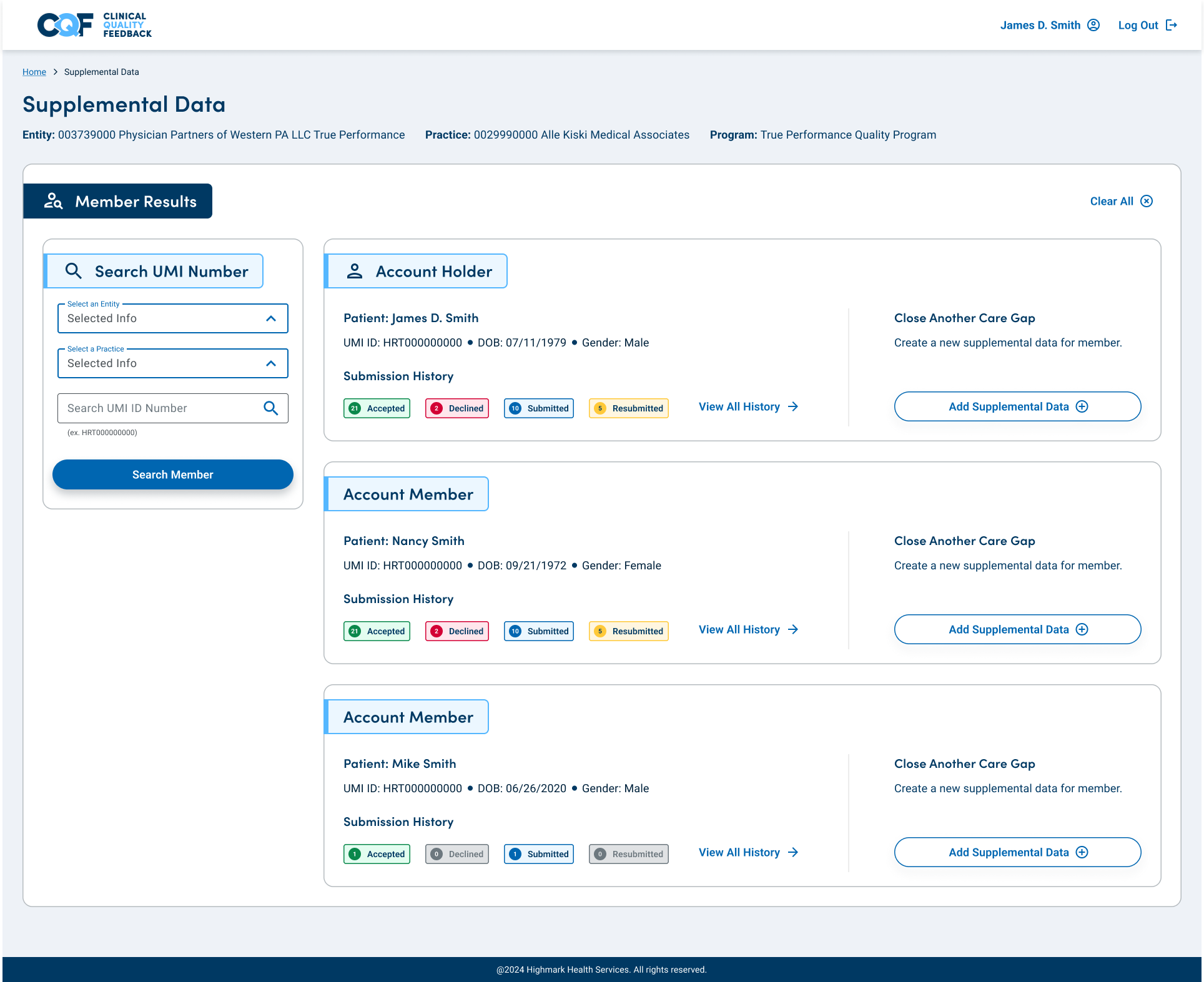
Clinical
Quality Feedback (CQF)
Project Details
(7 month Contract)
Team
UX Design Team (Manager)
Product Owners (2)
Business Executives
Development (Director)
My Role
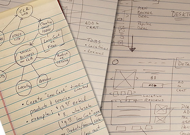
UX Strategist
UX Design
UI Design
User Research
Agile/Sprints
Tools
Figma
Adobe Suite
Jira
Microsoft Teams
Zoom Meeting
Platform
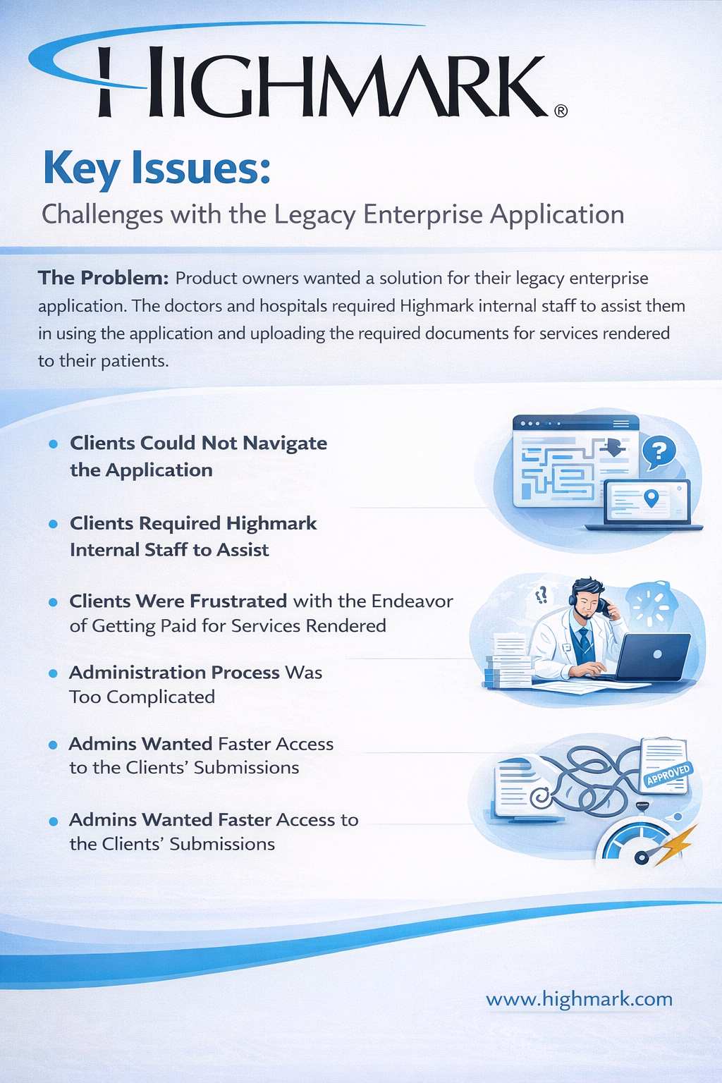
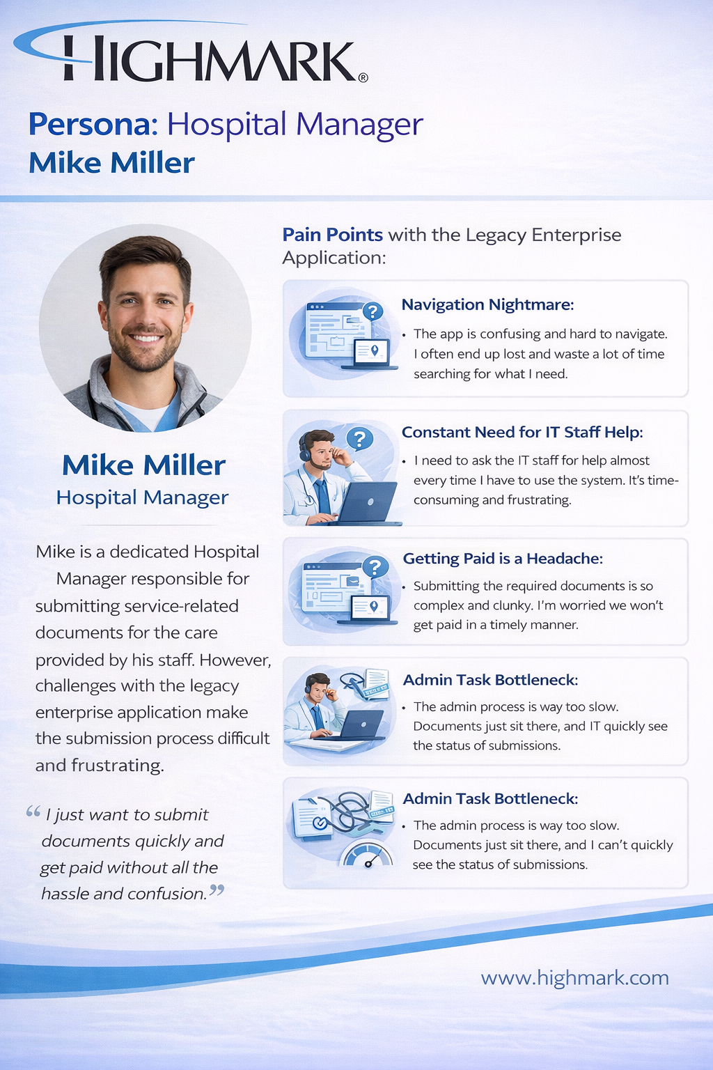
Enterprise Application
Power BI
Angular